Final Project: Making of the Atomic Bomb

Intro

The creation of the atomic bomb has changed history.  The ability of physicists to achieve nuclear fission and create nuclear energy has provided both great benefit and great destruction to society.  This project will go over the history behind the making of the atomic bonm- from the physics, to it’s development and testing, the first uses of the atomic bomb in Hiroshima and Nagasaki, and end by touching on the Treaty on the Non-Proliferation of Nuclear Weapons and the use of nuclear energy for the positive purpose of electricity.

Background in Physics: The Scientific Method Behind the Madness

            The atom is the basic building block of everything.  It is the smallest component of an element.  Atoms consist of a nucleus- containing protons, neutrons, and electrons.  The protons, neutrons, and electrons, are bound to the nucleus by electrical attraction. The type of element is determined by its atomic number, which refers to the number of protons in an atom.

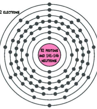
The development of the atomic bomb revolved around the manipulation of the element uranium.  Uranium is mined, just like coal and other metals.  Of the known uranium resources throughout the world, Australia has triple the amount of uranium than any other country.  Uranium consists of 92 protons and between 141 and 146 neutrons.  This variation in atomic weights plays a great role in nuclear physics.  The element uranium consists of 3 isotopes:

  1. Uranium-238 (U-238): Contains 92 protons and 146 neutrons (92+146=238).  Over 99% of natural uranium is U-238
  2. U-235: Contains 92 protons and 143 neutrons – Less than 1% of natural uranium is U-235
  3. U-234 : Contains 92 protons and 142 neutrons – Found in trace amounts.

http://scienceforkids.kidipede.com/chemistry/atoms/uranium.htm

Nuclear Fission
Nuclear fission is the process of splitting the nucleus of an atom.  Scientists discovered that splitting the nucleus of the U-235 atom could set off a chain reaction.  The problem was that less than 1% of natural uranium is U-235.  Using the fact that U-235 is lighter than U-238 (since it has 3 fewer neutrons), scientists were able to separate the two isotopes, creating “enriched” U-235.  Uranium is unique in comparison to other elements in that its nuclei changed significantly, breaking into two separate pieces nearly equal in size, when bombarded with neutrons. This “enriched” U-235 was the building block scientists needed to create the atomic bomb.  “Depleted uranium” (U-238 dislodged via the enrichment process) is used to make plutonium – another material that can be used to construct nuclear weapons.

http://www.daviddarling.info/encyclopedia/F/fissionnuc.html

The formulation of of the atomic bomb was accelerated by World War II.  From Albert Einstein’s 1905 formula E=mc2, or energy equals mass times the square of the velocity of light, came the idea that vast amounts of energy could be released if atoms were split.  Scientific work on nuclear fission took off in the 1930’s.  Milestones in nuclear development include:

  • 1933 Hungarian Leo Szilard realizes the possibility of the nuclear chain reaction
  • 1934Italian Enrico Fermi achieves the first nuclear fission
  • 1939:  Niels Bohr announces the discovery of fission and Albert Einstein writes to  President Franklin Delano Roosevelt (FDR) about uranium as a potential source of energy – just 4 weeks later, WWII began
  • 1941Glenn Seaborg discovers plutonium, and FDR approves plans for the development of an atomic weapon.
The United States feared Hitler’s Germany would discover the secrets to unleashing nuclear energy first and invent a terrible weapon.  Many Jewish scientists fled from the Nazis to the United States – Albert Einstein was among them.  Ironically, several of the most prominent scientists involved in the creation of the atomic bomb in the United States were European immigrants.  In 1941 President Franklin D. Roosevelt authorized plans for the development of an atomic weapon, nearly a year later on December 28, 1942 FDR approved plans for the Manhattan Project.
The Manhattan Project
The Manhattan Project, code named “S-1” was the super secret scientific and military endeavor for the research and establishment of the atomic bomb.  This project involved almost forty laborites and factories, many sprang up “overnight” in remote places across the United States.   Entire towns grew or sprang up seemingly overnight.  This endeavor employed nearly 200,000 scientists and laborers, who were brought in to staff the facilities.    The United States spent over $2 billion dollar in total on the project.

Key Facilities: (Facilities stood in isolation and had extensive security requirements, material was moved between these facilities)

  • Los Alamos, New Mexico: – Code named “Project Y” worked on bomb design and fabrication.  Two types of bombs were developed – uranium and plutonium.  The first atomic bomb testing, the “Trinity Test” conducted not far from this facility
  • Oak Ridge, Tennessee: Area of about ninety-square-miles. There were three major production facilities/test sites, each called by a code name:  1. “Y-12” held an electromagnetic uranium enrichment test, 2. “L-25” was used for gaseous diffusion uranium enrichment test and production, code named “K-25”, and 3. “X-10” a Nuclear pile design facility
  • Hanford, Washington: Area of almost one-half million acres.  Plutonium production facility, code named “Site W”
The “Trinity”

The Trinity Test was the first ever test of a plutonium weapon, nicknamed “The Gadget”.  It took place at 5:30 a.m. on Monday, July 16, 1945. over the southern New Mexico desert.  The test was surprisingly successful, achieving the desired effect during the first attempt. The Gadget served as the model for the plutonium bomb used in the second bombing of Japan, called “Fat Man,” dropped in Nagasaki less than one month after the Trinity Test.

The test was code named “Trinity” by J. Robert Oppenheimer, one of the leading physicists on the project often referred to as the “father of the atomic bomb.”  Inspiration for the name was derived from the poems of John Donne.  Oppenheimer referred  one of Donne’s sonnets, Holy Sonnet XIV, “Batter My Heart, Three-Person’d God.”  He also referred to the poem, “Hymn to God, My God, in my Sickness.” An excerpt from this poem is given below:

As west and east
In all flat maps—and I am one—are one,
So death doth touch the resurrection.

Watch footage from the Trinity Test in an excerpt of the History Channel’s show “Modern Marvels” here.

First Use of Atomic Bomb: Ending World War II

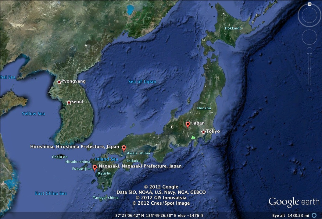
On May 7, 1945  Germany surrendered, ending WWII in Europe.  However, WWII continued in the Pacific as Japan refused to surrender.  The fighting in Japan was horrific and brutal.  The Japanese mentality was that surrender would be worse than defeat.  They were prepared to fight until the death.  With no end in sight, the United States had to weigh their options.  If the U.S. was to invade Japan a lot of manpower would be required, and the number of casualties on both sides would be tremendous.  The successful testing of   “The Gadget” during the Trinity Test a month prior provide U.S. with another option.  If the Japanese refused to surrender, the United States would detonate atomic weapons over Japan.  While this was a hard decision to make, it was concluded that the number of casualties caused by an atomic bomb would be fewer than the number of potential casualties that would result from invasion.  The United States dropped two bombs over the course of three days, the first in Hiroshima, and the second in Nagasaki.

Hiroshima

On August 6, 1945 a B-29 bomber named Enola Gay departed Tinian Island and flew 1,500 miles to Japan, targeting the military and communications center of Hiroshima.  Enola Gay carried “Little Boy” – a 9,700 pound uranium bomb.  At 8:15 a.m. “Little Boy” detonated about 1,900 feet above Hiroshima.  The impact was so great that Enola Gay felt shockwaves from the blast over 11 miles away.  Approximately 70,000 people were killed immediately, and 149,000 were dead by the end of 1945 from radiation sickness.  In the subsequent five years tens of thousands more died.  It is worthy to note here that the U.S. had not yet tested a uranium bomb, the only bomb tested had been made of plutonium.

The above map shows the extent of the damage cause by “Little Boy” geographically, from the point of impact (ground zero) and radially outward.

 Data from http://www.atomicarchive.com/Maps/HiroshimaMap.shtml

 I constructed these graphs using data from the AtomicArchive, using a primary axis to describe the numerical values or persons killed/injured, and a secondary axis to convey the percent of population killed/injured provides some interesting analysis.  In the casualties graph, one is able to observe that at a 0-1 km distance from ground zero, nearly the entire population was wiped out.  The further away from ground zero, the lower the percentage of the population that died.  One may also notice the increase in the number of casualties/injuries occurring in the 1.0-2.5 km range in comparison to the 0-1 km range. This may be explained in part by the fact that the 1.0-2.5 km range covers a much larger area and in part by the fact that it’s further from ground zero.
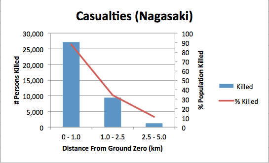
Nagasaki

After the bombing of Hiroshima, Japan still had not surrendered.  Three days later, on August 9, 1945, the United States dropped a second bomb, “Fat Man” – a 10,000 pound plutonium bomb.  A bomber named Bock’s Car delivered the second bomb, once again departing from Tinian Island.  At 11:01 a.m. “Fat Man” was detonated above Nagasaki.  Approximately 40,000 people were killed immediately, injuring even more.  In the following years the death rate climbed to a similar level as Hiroshima.

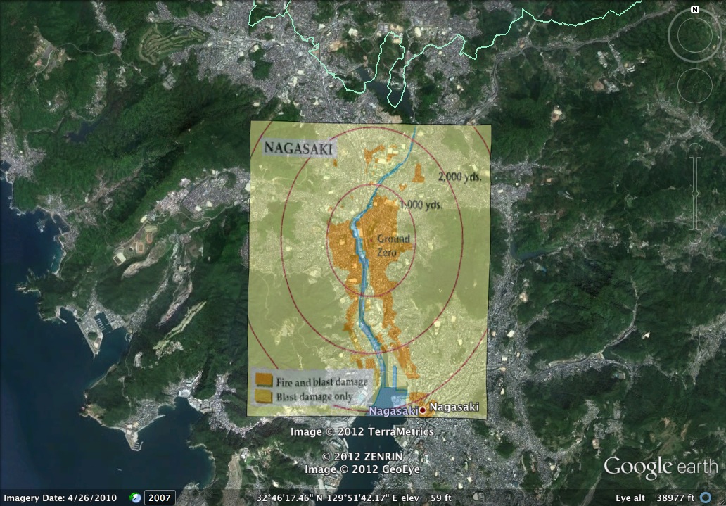
The above map shows the extend of the damage cause by “Big Man” geographically, from the point of impact (ground zero) and radially outward.

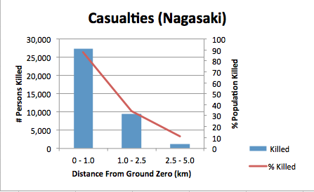
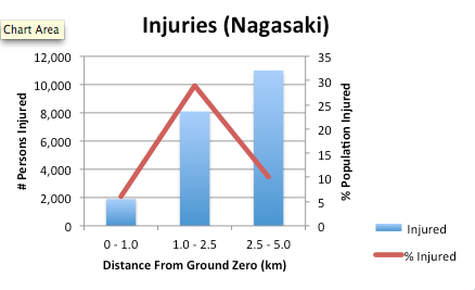
Data in these graphs were also taken from the Atomic Archive.  Similar observations can be made based on these graphs in comparison to the graphs concerning Hiroshima.  There is an inverse relationship between the number of casualties and the number of injuries.  This is likely due to the fact that the further away from ground zero, the more people suffered injuries than died.  Within one kilometer of ground zero, most people were dead so they couldn’t be counted as injured.

Conclusion

 On August 14, 1945, five days after the bombing of Nagasaki, Japan finally surrendered.  Without the development of the atomic bomb, WWII would have likely continued on for much longer and many more lives may have been lost.  The technology produced in the development of the atomic bomb has been both a blessing and a curse.  The dangers of nuclear weapons have been recognized worldwide, resulting in the Non-Proliferation Treaty (NPT).  The NPT seeks to prevent the spread of nuclear weapons, the disarmament of existing nuclear weapons, and to promote peaceful uses of nuclear technology.  The majority of countries have vowed to honor the NPT, but some have not.  Fear still exists that certain countries continue to develop such weapons of mass destruction for future use.

Nuclear energy has it’s peaceful uses.  Nuclear power plants provide a source of electricity needed that does not rely on resources, such as coal.  While fewer countries contain nuclear power plants themselves, many of them are receivers of the electricity produced by these plants.  While research in nuclear fission began for defense purposes, the technology established during the process has progressed to be used for peaceful civilian services, such as providing electricity to nations across the world.  Without the making of the atomic bomb this technology may have never been discovered.

Preservation

Preservation of this data is based on idea of L.O.C.K.S.S. (Lots of copies keeps stuff safe). This project has already been set in a tangible form via blog.  In addition, I have put together on my computer a folder of the images used (in multiple formats- .TIFF, .JPEG, .PNG, .GIF) in hopes that the files and file types will withstand the test of time.  The textual portion of this presentation has been saved in a Word file as well.  There are multiple copies of this folder – on my personal computer, external hard drive, a flash drive, in Google Dropbox, and an additional copy on another computer.

References

  • Closing the Circle on the Splitting of the Atom. DOE. Washington, D.C. Department of Energy, January 1995.
  • F.G. Gosling. The Manhattan Project: Making the Atomic Bomb. DOE. Washington, D.C.: Department of Energy, September 1994.
  • http://www.atomicarchive.com/Maps/HiroshimaMap.shtml
  • http://www.atomicarchive.com/Maps/NagasakiMap.shtml
  • http://www.world-nuclear.org/info/inf75.html
  • http://americanhistory.about.com/library/timelines/bltimelinemanhat.htm
  • http://www.euronuclear.org/info/encyclopedia/n/nuclear-power-plant-world-wide.htm
  • http://www.youtube.com/watch?v=Ru2PWmGIoB8
  • http://www.cddc.vt.edu/host/atomic/trinity/trinity1.html

Practicum: Chart/Map (not-so-basic)

I missed the basic chart/map practicum- so since we have moved far past that I put together some more complicated pieces.

This map shows the severity of damage done by the atomic bomb dropped by the United States on Nagasaki, Japan on August 9, 1945 combination of Google Earth and overlay image from atomarchive.org.  

Data for this graph is from the same resource.  The graph shows the number of deaths caused by the atomic bomb and what percent of the population was killed.  In my final project I am including additional graphs for the number of injuries.  From this chart you can see how the greatest number of casualties occurred closest to the site of the bombing, where nearly the entire population was wiped out.


Photography in the Media

Pardon the delay, below is my reaction to Errol Morris’ article Photography as a Weapon.

Aa visual learner I process visual information faster. I have always been drawn to photography as an art form and as a visual link to the world we live in. I liked what Morris said about a photograph’s “ability to copy reality…” and “to alter reality.” Visual images have a powerful presence in the lives of most, from pictures of your family’s Christmases’ to advertisements on television we are constantly exposed to an array of visual images. Which one’s are important?

The rise of the digital age brings the advancement of the ability to deceive. However, “information warfare”, as Henry Faird calls it, of course has been going on for years. As Faird and Morris discuss past dictators wartime propaganda you realize how photoshop was never truly needed to deceive, it simply makes it easier. Visual information warfare takes place from our own living rooms to grocery store tabloid articles. From commercials for diet pills to the more serious altering of official imagery. The media often dictates what the average citizen mentally ingests. It is up to the individual to the digest the information being fed. Photoshop and other digital technology programs only aid in deception but as always it is up to the individual to discern the value of the information. While it is important to be cautious when accepting information I also agree with Morris when he says “Photoshop is not the culprit. It is the intention to deceive.” We all know the power of photoshop and because we know it can be used for deceit we must be mindful of what we are looking at and make an educated decision on what is real and what is fake.

“Information warfare”, as Faird calls it, not only uses visual imagery to deceive but the altering of an images’ caption as an equally effective tool. We see this all the time in tabloid articles. A picture of a make-up less celebrity gets turned into a celebrity “battling cancer”. The deceiver does not have to use powerful digital technology to alter an image’s meaning. An image is only so good as it’s caption. As Erroll Morris points out, a simple rewording of a caption can influence the entire way we view the image. We see this in the funny photo captions posted on Facebook everyday. A seemingly insignificant photo turned hilarious with a simple caption, altering the entire meaning of the photograph.

As digital technology has helped our world community thrive, making commodity readily available and community easily accessible, it has also lessened our visceral senses. Everything is easy, at our fingertips and seeking and looking are not a valued ability. This generation must be aware and take time to investigate. The article was very concerned with what Iran’s intentions behind releasing both images were. To those intentions, who knows? But I do agree with Charles Johnson when he says it’s important to expose fraud, not because of what it is trying to hide but because it is hiding anything at all. While he was adamant that it was of the utmost importance to reveal the photograph as fake because of our political relationship with Iran, our “mortal enemies”, I believe that the utmost importance was that we revealed the image as fake at all. Images and information should be represented truthfully regardless of bias and we should also be careful to examine images and information that are presented to us by those of us we trust to speak truth.

Preservation Path for Family History

The Digital Preservation Guide from the Library of Congress provides some good guidelines which can be used to preserve content for digital projects- not only personal projects, but also academic or corporate.  If I were to create a digital project for my family history I would start by accumulating all the raw data I would potentially incorporate.  These could be documents, photos, videos, or any other artifacts I could use to establish a history.

The first step would be to go through the artifacts and short them into relevant categories, discarding the ones not of interest.  Many of the older photographs would need to be converted to digital, in which I would use a high resolution scanner to upload and save the files digitally, preferably saving them as a .jpeg or .tiff files.  My grandfather has old newspaper clippings which I would also like to include.  The same could be done with video using the appropriate software, but unfortunately my family has very few home movies.

Once the files are in digital form they should be individually labeled and put into corresponding file folders.  Folders could be based on person/family, time period, or item type (i.e. photographs, videos, articles, etc.)  I think I would create folders based on specific nuclear families and create subfolders within them based on file type.

Backing up the data is the most important part.  I would be sure to save the data on both my internal and external hard drive, and also create a copy on my parent’s drive, as well as another online such as on a website or saving to Google Dropbox.

Scarcity or Abundance (Rosenzwieg)

There was certainly no scarcity of information in Roy Rosenzweig’s Scarcity or Abundance? Preserving the Past in a Digital Age! I found the amount of information somewhat overwhelming, but thoughtfully and adequately played out.  This essay is one I think any scholar can benefit from reading, encouraging scholars to “keep up with the times” of technology, and facing the reality of the needs/benefits of digitization and also difficulties.  Below are a few things I took away from the article.

I found it was interesting that the author brought up how fear of loss is of much concern to historians and others preserving digital data, when the bigger issue is that digitally recorded materials may no longer be readable in the future.

Here is the key difference from the paper era: we need to take action now because digital items very quickly become unreadable, or recoverable only at great expense….The greatest concern is not over what has already been lost but what historians in fifty years may find that they can’t read.

Due to changes in hardware/software types often no longer support the documents, the ones and zeros used to compose the document do not mean anything without the proper support system to run them. Aside from this, damage to a single bit will make the entire file useless.
Rosenzweig mention several other issues we have addressed in class, specifically in regard to authenticity and use.  I agree there need to be measures for authenticity and integrity management, but who should this responsibility be left to? As if public access wasn’t enough of an issue, I think fear that programs such as Google may become greedy and start charging for their services is a valid concern.  However, I’m not sure this would actually take place.  While companies certainly have the ability to make that decision I think it would not be in their best interest to do so.  People will do whatever they can to get around paying services, so if there is a free option available they will take it.
It came as somewhat of a surprise that most historians are hesitant to become an active producer and user of digitized materials.  Information Technology is a relatively new field in comparison to others, such as the humanities and social sciences.  I think it would be a good idea implement continuing education requirements for professors and corporations.  This would increase knowledge of such systems and give individuals the means needed to  get involved in digitization.  At this point in time it appears there is not enough focus or direction placed in such systems, which makes it difficult for digital preservation to take place.
It is clear that more attention needs to be focused on preserving digital data, by individuals, scholars, corporations, and regulatory systems.  There is a lot of work left to be done.  This is a project that will require people from many fields and places to work together.  International conflicts over the flow/usability of information are likely to ensue and we need to be prepared to address these issues, as well as the many anticipated.

Ngram Viewer on Nuclear Weapons

For my final project I plan to l examine the history of nuclear weapons.  This graph is helpful because it shows the peaks in literature concerning nuclear warfare, weapons, and atomic bombs.  I took a look at Wikipedia’s History of Nuclear Weapons to get a better idea of where some of these peaks came from.  WWII and the Cold War seem to surround the majority of the information.  Here are some points of interest:

  • 1942– Starting point.  Theoretical conference for the development of the atomic bomb, University of California, Berkeley
  • 1945– WWII. United States bombs Hiroshima and Nagasaki, Japan
  • 1949– First atomic bomb testing by the Soviet Union
  • 1952– United States “Operation Ivy,” first U.S. fusion bomb test
  • 1962– Cuban Missile Crisis
  • 1963– Limited Test Ban Treaty
  • 1927– NATO plants Pershing II missiles in Western Europe in response to USSR missiles
  • 1982– Protest against nuclear warfare in New York
  • 1987– Protest against nuclear warfare in Nevada

Practicum: Chart With Historical Data

For this practicum I wanted to show the number of U.S. troops in Iraq and the number of casualties by year.  Number of boots on ground were retrieved from the Federation of American Scientists, specific document found here.  Number of casualties were given by icasualties.org.

Graph 1:  I could not figure out how to make the x-axis to correspond to the year.  If this cannot be changed, it might be better to remove the horizontal axis category completely and add a description to signify the corresponding years.


Graph 2: I had the same problem as Graph 1.  In addition, I wonder if it would be possible to make two different scales for the two series, since casualties barely show on the graph and are only indicated by number.


To improve these graphs I would solve the unresolved formatting issues, and also include information through 2012 (permitting I can find it).  I found number of casualties for each year, but not the number of troops on found.  The FAS provided estimated for the numbers of troops on ground from 2009-2012, which made me think another interesting chart would be to show how the estimates showed the actual.

“From Babel to Knowledge” Reaction

I rather enjoyed this reading because it gave us a glimpse at how work in academia is changing in the digital age.  Many of the prior readings, especially the ones from the textbook, were much more technical.  “From Babel to Knowledge” combined the technical aspects with practical application to show how/why digital research is useful, the status of such programs, and their potential for the future.  It was really cool to get a glimpse at the projects Professor Cohen has been working on, and it further enlightened me on the purpose of this course.

Starting out with the story of the Library of Babel was a good way to get the reader’s attention and ease into the subject.  In the syllabus finder section Cohen shows the advantage of creating a more specialized API for a specific purpose such as mining syllabi so that professor and students can enhance their class experience.  I think this is a great idea, multiple brains are always better than one.  Being able to find new course materials, such as readings and assignments, makes the class more enjoyable for both parties.  There are some professors who teach the exact same course year, after year, after year.  The problem with that is that readings can become dated and the professor is stuck into routine- grading the same assignments time and time again.  Having the ability to search syllabi and adopt new material increases the quality of a course and encourages professors to continue learning.  I liked that Cohen walked us through how he developed the program as well.  It made the thought of creating such a program much less intimidating.

The author expresses three lessons he has  learned through his research:

  1. More emphasis needs to be placed on creating APIs for digital collections.
  2. Resources that are free to use in any way, even if they are imperfect, are more valuable than those that are gated or use-restricted, even if those resources are qualitatively better.
  3. Quantity may make up for a lack of quality.
I agree on all of these points, but my question is what he sees for the future in resolving the issue of restricted access.  I cannot speak for others, but I can say for certain that this article convinced me that APIs are not just something for computer scientists.  I really feel there is going to be a major shift in the near future in the approach to academia, and I think it is really cool that George Mason has a team dedicated to this cause.  It makes me wonder how many universities have such programs, or teach courses like our digital history course that is an IT approach to a subject typically falls far from the IT department.


Powerpoint: Good or Evil?

PowerPoint has become nearly unavoidable in the modern world.  It is used by students, teachers, and corporations every day.  While PowerPoint is a useful tool for presentations, it is only useful when used properly.  Unfortunately, it is misused more often than not.  PowerPoint should only be used when it enhances the presentation rather than detracts from it.  Obnoxious color schemes and over-saturation of text and images distract the listener from the topic at hand.  The powerpoint should not of assistance to the presenter, should rather assist the audience by complimenting what the presenter is saying.

I cannot tell you how many presentations both by students and professors I have had to sit through and listen to the presenter read directly from the slide.  I honestly feel it is a waste of everyone’s time to conduct a presentation this way.  I could read the slides from the comfort of my own home and get the point.  One good piece of advice on powerpoint presentations in my Business Communications course is to only show the slide while it is relevant to what you are saying and revert to a blank screen while you present information before the next slide.

Based on Edward Tufte’s “PowerPoint is Evil,” Tufte would likely disagree with me and argue that PowerPoint is evil all of the time.  I do think it can be useful, but I see how it becomes evil more often than not.  I think Tufte brought up a good point in talking about it’s use in elementary schools.  Our writing skills are developed early on and I think it is important that children are encouraged to write in full sentences and be able to expand on their thoughts, rather than simplifying them into bullet points.  What I think he means by “respect your audience” is that a presentation is between you and your audience, not between you and your powerpoint.  We should not boggle down their minds with nonsense but rather take the time to become confident in what you are speaking about to the point that you have no need to use PowerPoint.  Peter Norvig does a good job mocking the flaws of PowerPoint and how it is misused in his Gettysburg Cemetery Dedication presentation slides, showing a tacky color scheme and how the minimalist text provides absolutely no advantage.

Reaction to the Feltron Reports

The Feltron Reports are a very interesting way of attempting to encapsule an entire year’s worth of information into charts and graphs.

2007 Report: The presentation is definitely visually appealing, but not always easily read or interpreted.  I felt some information was easier to comprehend than others, and often desired additional metadata to understand the material but none such was available.  For example, the shopping section lists “Meteorites purchased.”  Are these actual meteorites? I knew you could pay to name a star, but meteorites?  I’m a little confused.  I also didn’t see the purpose in switching from alternating between using numerical digits or writing out the word.  Is it just to create interesting visual diversity?  Lastly, maybe I just have bad eyes, but I really had to concentrate or zoom to read subheadings.

2010-2011 Biennial report:  I thought showed some improvements from 2009.  There was more metadata, and the tables and graphs were easier to read.  They seemed to better convey information rather than primarily for visual stimulation.  It makes it easier for the viewer to understand the information given.  I liked that it also seemed to have a sort of “table of content” in the beginning providing some information on the report as well as organized charts/graphs.  The information in my opinion flowed much more logically than the 2007 report.

I commend Mr. Felton’s dedication and attention to detail.  Personally, I think it would drive me crazy to have to record and monitor every aspect of my life.  If he didn’t have OCD before, I wouldn’t be surprised if he did now!  What I think we should take from the Feltron Report is that there are endless ways to present information, and through practice, trial, and error, these methods are improved.   In addition, the reports show the benefit of being able to compare data from different periods.