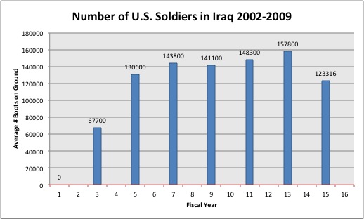
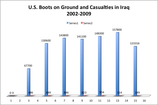
For this practicum I wanted to show the number of U.S. troops in Iraq and the number of casualties by year. Number of boots on ground were retrieved from the Federation of American Scientists, specific document found here. Number of casualties were given by icasualties.org.
Graph 1: I could not figure out how to make the x-axis to correspond to the year. If this cannot be changed, it might be better to remove the horizontal axis category completely and add a description to signify the corresponding years.
Graph 2: I had the same problem as Graph 1. In addition, I wonder if it would be possible to make two different scales for the two series, since casualties barely show on the graph and are only indicated by number.
To improve these graphs I would solve the unresolved formatting issues, and also include information through 2012 (permitting I can find it). I found number of casualties for each year, but not the number of troops on found. The FAS provided estimated for the numbers of troops on ground from 2009-2012, which made me think another interesting chart would be to show how the estimates showed the actual.


