I missed the basic chart/map practicum- so since we have moved far past that I put together some more complicated pieces.
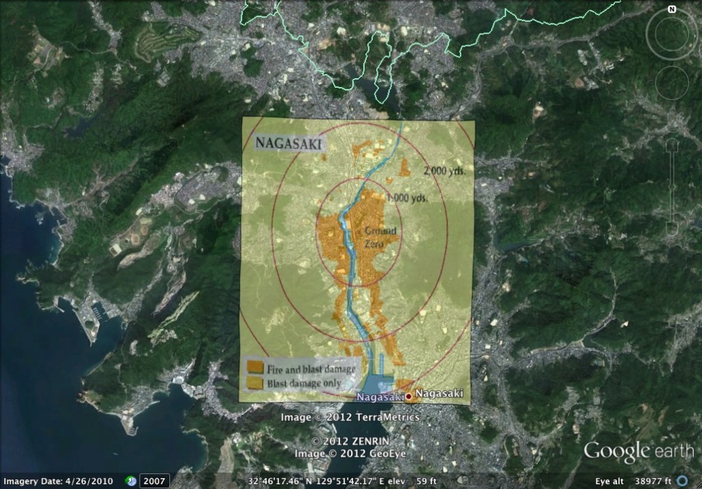
This map shows the severity of damage done by the atomic bomb dropped by the United States on Nagasaki, Japan on August 9, 1945 combination of Google Earth and overlay image from atomarchive.org.
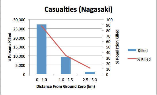
Data for this graph is from the same resource. The graph shows the number of deaths caused by the atomic bomb and what percent of the population was killed. In my final project I am including additional graphs for the number of injuries. From this chart you can see how the greatest number of casualties occurred closest to the site of the bombing, where nearly the entire population was wiped out.


